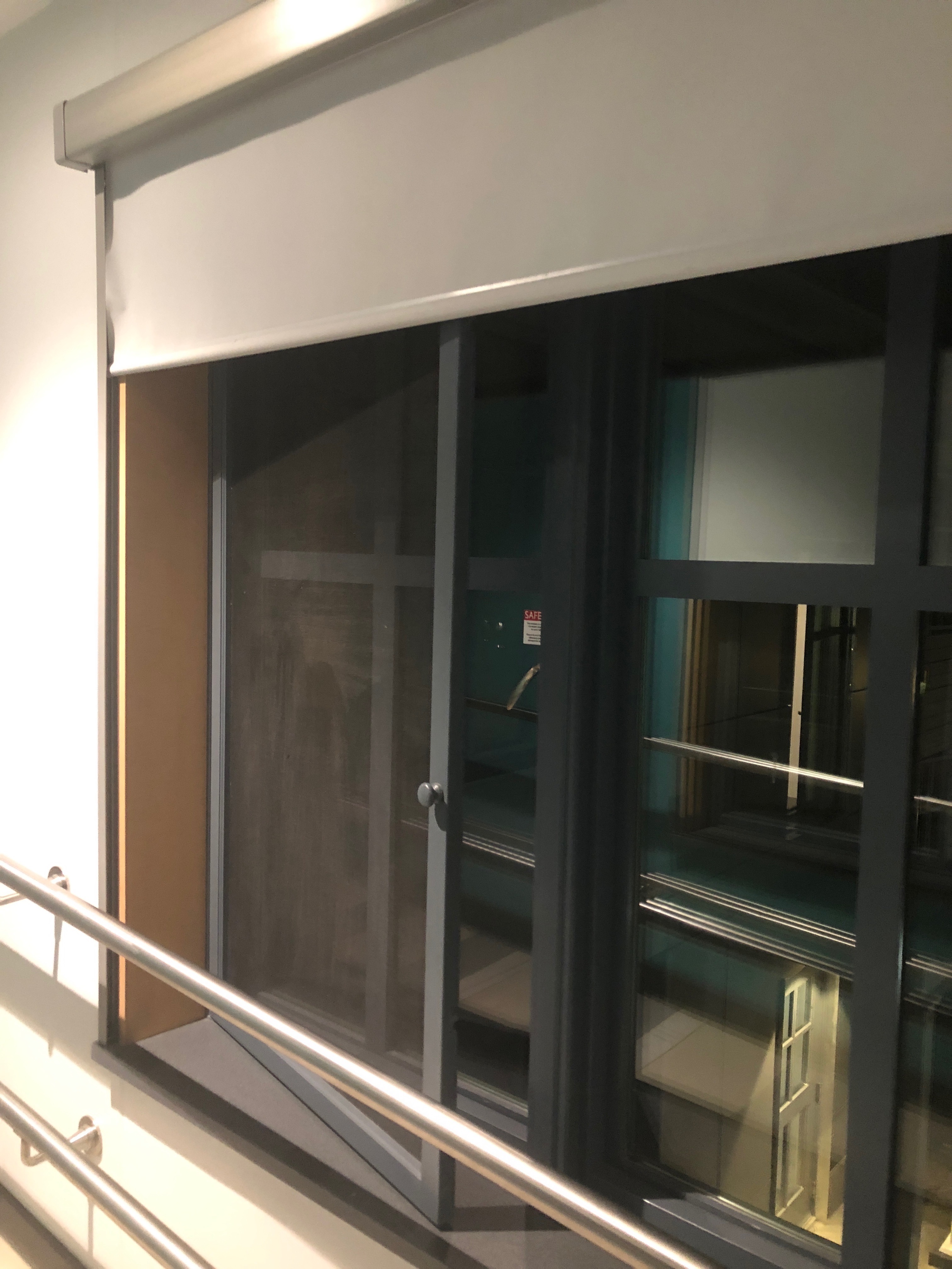
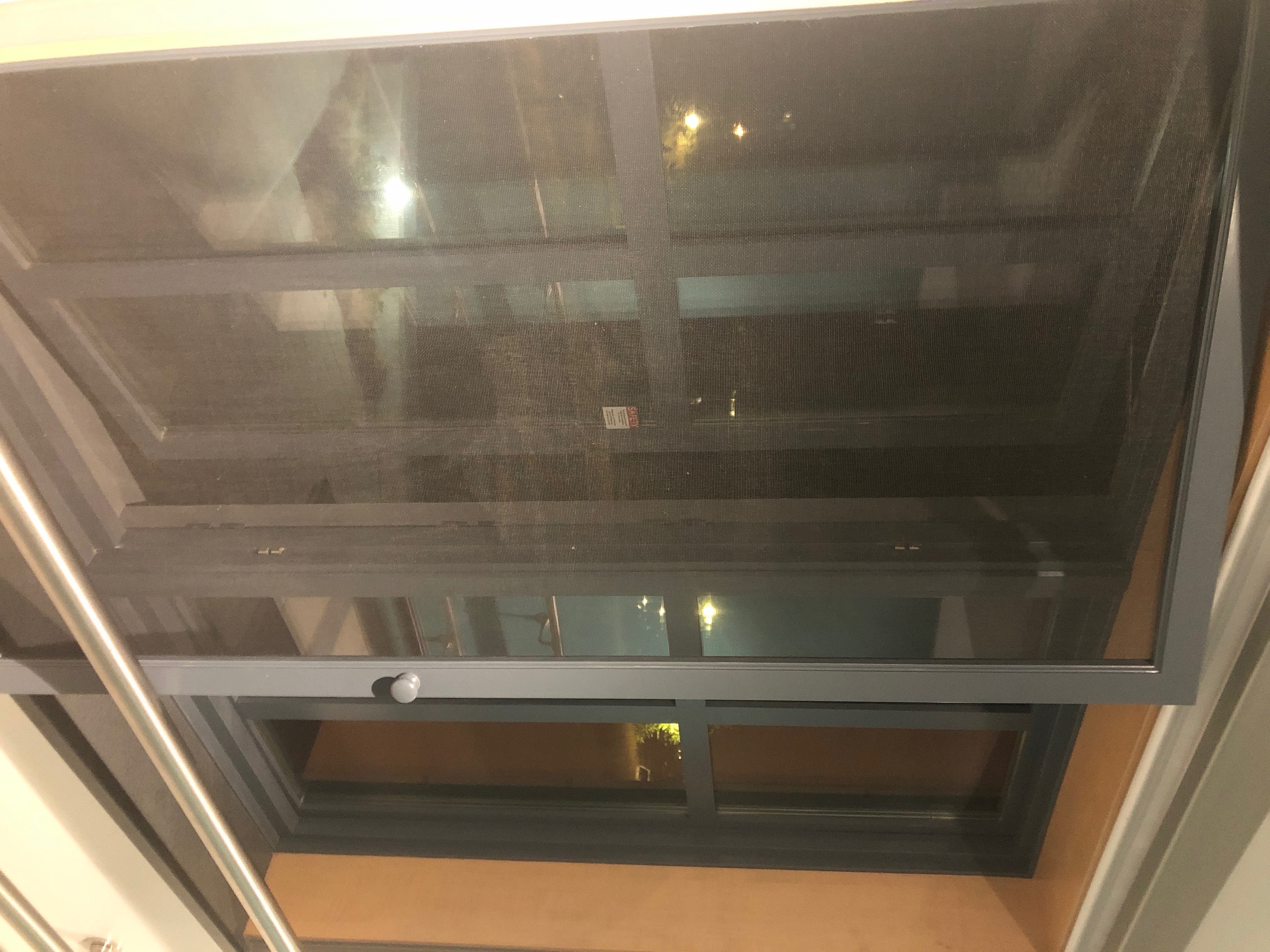
Bad design is found throughout Williams. An example of bad design that students encounter at Williams can be found in the Horn Hall dorms. The windows in Horn Hall are extremely difficult and unintuitive to open. I chose this design because I believe that it should be EASY to open the windows and this is a common problem faced by students living in this dorm. The images below show how inconvenient and unintuitive it is to open a window in Horn:

If I wanted to open the window of the dorm, I have to go through a series of unintuitive steps. First, I would have to raise the blinds all the way to the top of the window as can be seen in the photos. Then I would have to open the screen by pulling on the handle such that it would open like a door. Then, I would have to open the window by pushing on the window itself.
This is a poor example of window design at Williams because 1) most people are too short to close the blinds/raise the blinds to the top of the window 2) the ability to open the screen door is hindered by the metal bar, making only a narrow opening for a hand to open the window itself 3) the unintuitive design is a hazard in case of emergency. See more image below.

These windows is an example of bad designs found at Williams. Since most people have never used a window like this obviously design and aesthetic was a priority over functionality. Horn Hall is a new dorm designed with features for sustainability and energy conservation. These goals were clearly prioritized with the design of these windows. Functionality and accessibility were not apparent in these designs.