A public declaration of principles, policies, or intentions resulting from my experience in design.
Introduction
Before enrolling in CS 376: Human Computer Interaction, I did not realize the extent and complexity of the design process. Now, as we are concluding our semester I have learned the process of developing a new and unique product that will solve problems for users. Over the course of this semester, I learned that the design process is complex and never the same for two projects.
Over the course of the semester, I had the opportunity to work with a phenomenal team to develop a new project for Williams College Museum of Art (WCMA) that improves visitor accessibility. Museums are often inaccessible to people of color and there is a lack of awareness and conversation around the exhibits and art at WCMA. Our team developed a product ‘Museums for All’ to solve this problem and make museums more accessible for a wider group of visitors.
We researched the problem by holding research sessions with Williams College students and staff members from WCMA. Through our design process and research session, we had to start over, change ideas and constantly brainstorm to make a feasible solution that will change the museum experience (Link to our project website can be found here).
As a result, the complex design process I worked through over the course of the semester taught me a lot. As the semester comes to a close, I can easily list 5 principles that have defined my experience in design. These principles result from our design experience and class lectures/readings. They permanently changed my perspective on the design process and will be applicable to any design process. These principles are extremely useful for the next time I have to approach the design process.
1. Identify an ACTUAL problem with a FEASIBLE solution
One of the most important concepts we covered in class and the concept that is the most essential to remember when starting the design process is that you are NOT the user. From our readings the very first week of class, we learned that human-centered design requires that the designer has a good understanding of psychology of the user and technology.
According to Conceptual Design, there are 4 key principles of conceptual design (“Conceptual Design: Moving from Requirements to First Design”):
1) Keep an open mind but NEVER forget the users and their context
2) Discuss Ideas with other Stakeholders as much as possible
3) Use low-fidelity prototyping to get rapid feedback
4) Iterate, iterate, iterate
These 4 key principles of conceptual design are extremely important to keep in mind, as I learned throughout this design process. It allows for designers to truly identify a problem and determine a feasible solution.
Our project group had to iterate through multiple ideas and designs. This was only possible because we had to remember that we were NOT the user and following feedback and listening to users and their contexts was the only way to develop a product that solved a problem. Our group ultimately switched design ideas after receiving criticism from other users and designers in our class. By discussing our ideas and using paper prototypes we were able to iterate, iterate, iterate and come up with an even better design. Our design revision process is outlined on our project website and can be found here.
2. Collaborate with Others
This semester we spent a whole week reading and learning about the importance of brainstorming and teamwork. A big aspect of learning how to design a process well is to collaborate with others. In order to be creative, you need to be able to brainstorm. To maximize creative ideas, one needs to be able to work with others. As drawn on from the readings, working collaboratively in teams means “listening and responding constructively to views expressed by others, giving others the benefit of the doubt, providing support, and recognizing the interests and achievements of others” (Katzenbach and Smith (1993). The Discipline of Teams.). Once you are able to work as a team, then the design process becomes more creative as you are able to work together to come up with new ideas.
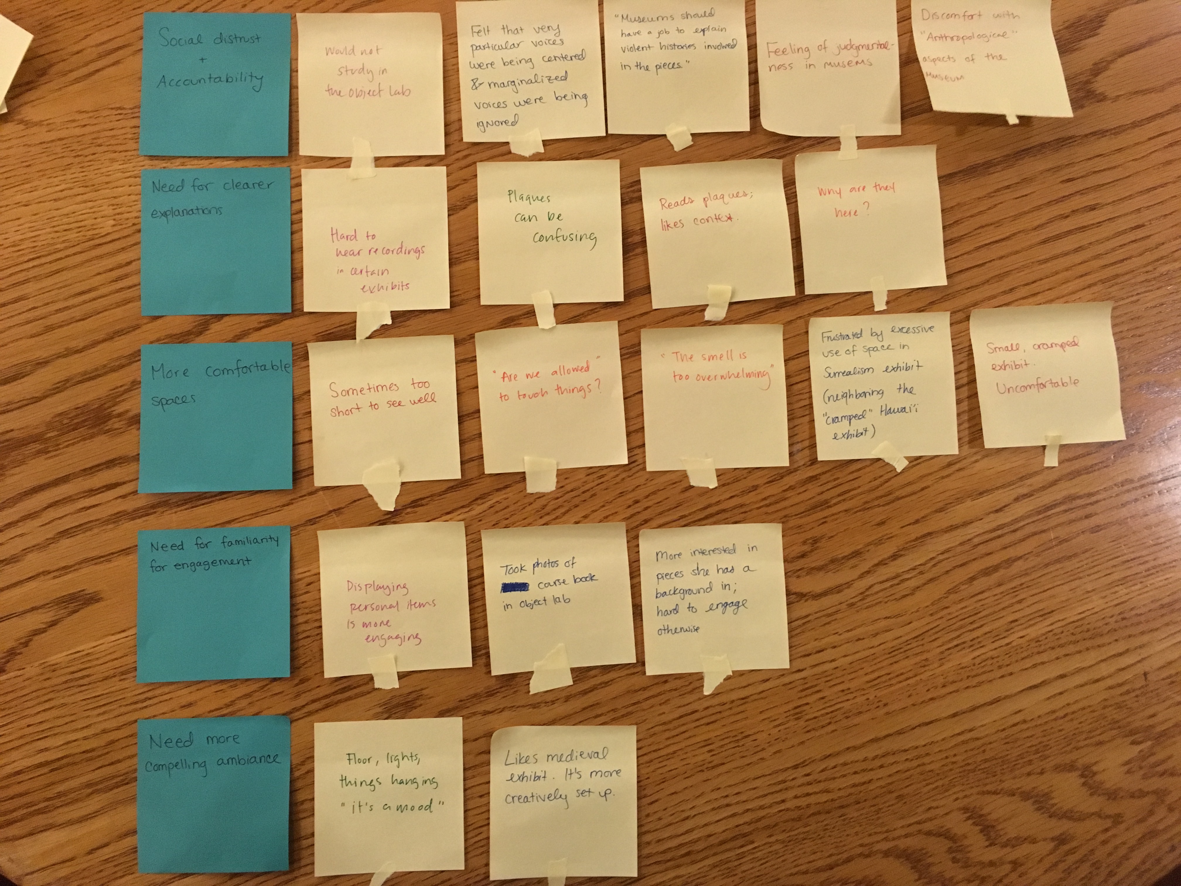
Throughout the semester we had the opportunity to work in teams to design projects to improve accessibility at WCMA. By working with teams, we were able to come up with ideas that would uniquely solve a communication and accessibility visitors at WCMA were facing. In class we had the opportunity to learn and implement Affinity Diagrams that show the scope of user problems and potential solutions. The power of collaborating with others was essential when brainstorming the Affinity Diagram and eventually walking the Affinity diagram. The Affinity diagram is structure to tell the story of customers to highlight common issues, themes and key elements that are relevant to the team’s focus. Without working with two other people, these brainstorming ideas definitely would not have been the same if only one person was working on it. More can be read here about my team’s brainstorming process and read here about my team’s affinity diagram process. See below for an image of our affinity diagram, created only after collaboration and ideas of three different people contributed ideas:
3. Always remember accessibility
If you were to design a product for users but no one was able to use it then it would be pointless to design the product in the first place. This is an extremely important fact that was stressed throughout our readings. In “The Design of Everyday Things” the idea of accessibility is stressed in multiple chapters. To sum it up, “good design requires good communication, especially from machine to person, indicating what actions are possible, what is happening and what is about to happen” (Norman, Don, “The Design of Everyday Things”).
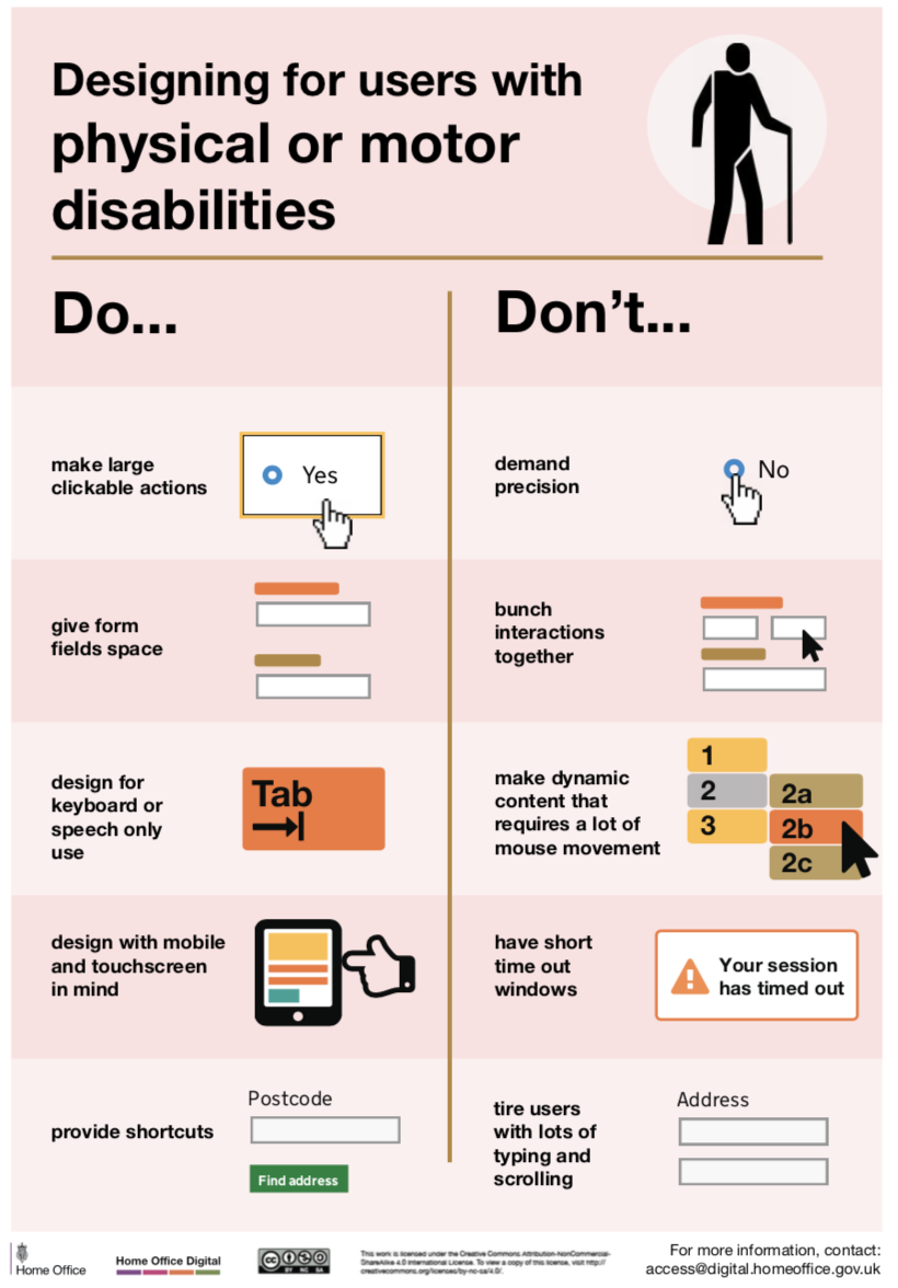
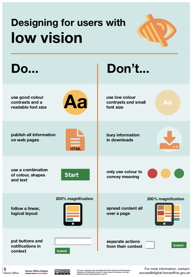
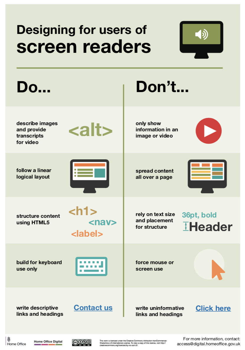
In another one of our readings, we read the key components, Do’s and don’ts when designing for accessibility. The graphics in these readings were incredibly helpful when we were designing our projects and a select few can be viewed below:


These graphics are very helpful and easy to reference when designing because they are grouped by disability or problems users many have that might affect the usability of the product you are designing. We used these graphics and other readings to design our project group wire frames and paper prototypes in a way that ensures user accessibility. Specific orientations, spacing and coloring was used to maximize usability. Details of our wire frames and design can be found here.
4. Determining and Following Ethics Makes Your Designs Better
When designing new products, it is very easy to get carried away with technology, innovation and creativity to the point where users are forgotten and ethics are not followed. After designing with my project team for the duration of the semester, we learned the importance of changing design ideas if the design does not actually solve the problem for users (Read about our inital design here. As mentioned previously, we initially designed a discussion forum to solve the problem of accessibility for users at WCMA. However, we realized only AFTER receiving feedback and criticism that the design, which was only a discussion board, does not actually solve any problems but instead they potentially make accessibility problems worse. As a result, we learned the importance of always keeping the user in mind and being open to criticism. We then changed our design to a unique museum installation (more can be read about the new design here) and found that this design is a much better solution for users.
This experience has helped me determine my OWN personal code of ethics. It is important for everyone to find discover own, especially before designing. The top three points of my personal code of ethics are outlined below:
1) Listen to the users 2) Don’t use the easy way out, do the extra work and change your ideas 3) Be aware of criticism and other people’s opinions
These are just a few takeaway points from my view on ethics when it comes to designing products. I believe that the more I design, my viewpoints, opinions and ethics will change with experience.
5. Don’t be afraid to start over
As mentioned numerous times throughout this manifesto, my experience in HCI has required lots of iteration, teamwork and collaboration to create a product that actually solves problems. This principle is very basic, but it shows that if leaps of faith are taken, hard work pays off and you will be rewarded with a design that you are proud of, especially if it is useful and solves problems. Read more about our design change struggles and decision to revise our design here. Our decision to start over was indeed scary at first, but we realized that we will inevitably create a more effective design that will be a better solution to the user’s problem.
Conclusion
To conclude this design manifesto, highlight that this manifesto and the design process can be applicable to ANY project or user problem. This design process indeed has impacted our overall design and project that we created this semester. We learned the difficulties of changing designs, interviewing participants, and working with others. However, although the design process is difficult, long and complex, it is worth it. With a complex, structured design process that requires constant iteration of solutions to user problems, better products can be made and the more you can learn as a designer. A design process is essential for humans and computers/technology to interact and find solutions to problems. By remembering this design manifesto and the five principles, my approach to the design process will be more effective.
